Read Frequency Response Charts: Pick Your Podcast Mic
By Nora Adeyemi • 11th Mar
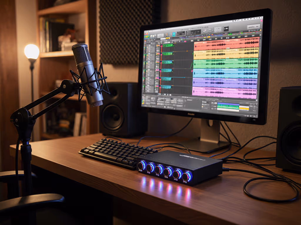
Frequency response charts look intimidating, a jagged line on graph paper that seems designed to confuse rather than clarify. But for podcasters and voice creators stuck in untreated rooms, making mic decisions based on hype instead of data, these charts are actually your clearest path to finding a microphone that flatters your voice without relying on editing wizardry. Let's decode them together. If your room is lively or echo-prone, learn practical fixes in our room acoustics guide.
What is a frequency response chart, and why should I care?
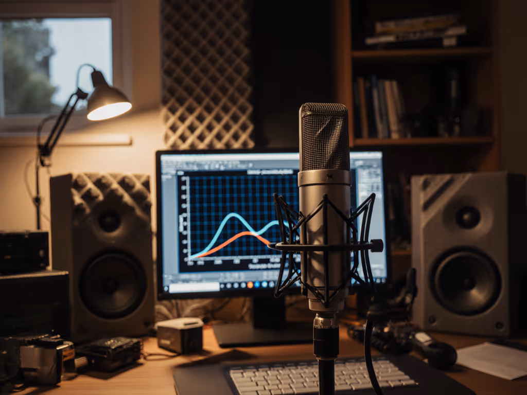
A frequency response chart illustrates how sounds on the frequency spectrum are reproduced by the microphone being assessed, using a decibel scale on the vertical axis and a logarithmic frequency scale along the bottom. In plain terms: it shows which frequencies your mic boosts, cuts, or leaves alone.
Why this matters for podcasting: your voice doesn't occupy the entire audible range. While speech harmonics extend further, the critical range for voice communication extends up to about 4,000 Hz. Most podcast mics are designed with this in mind. But here's the catch: many mics also add subtle bumps or dips in the upper midrange and highs, where sibilance (that harsh "S" sound) and presence live. If your mic bumps those frequencies hard, your sibilance will be aggressive. If it dips them, your voice may sound thin or distant.
This is why general specs like "20 Hz to 20 kHz" are not very useful. Two mics with identical frequency ranges can sound wildly different on your voice.
The real-world pain point
I once watched a first-time host clutch a microphone like an ice cream cone, peaking the preamp on every laugh. We swapped her mic, angled it slightly off-axis, locked a fist-width distance with her hand and the diaphragm, added a pop filter, and enabled direct monitoring. For step-by-step placement techniques that tame plosives and sibilance, see our podcast mic positioning guide. Her next take was clean, her shoulders dropped. The chart for that mic showed a gentle presence peak, not aggressive. Combined with off-axis rejection that smoothed her plosives and room tone, the capture was naturally broadcast-ready.
The mic wasn't magic. The chart told us it would work.
How do I actually read one?
Let's break down the axes. On a typical frequency response chart:
- X-axis (horizontal): Frequency in Hertz, usually ranging from 20 Hz (bass) to 20,000 Hz (treble). This is logarithmic, meaning the left side is crowded and the right is spread out, which mirrors how your ear perceives frequency.
- Y-axis (vertical): Amplitude in decibels (dB). A flat line at 0 dB means the mic is "flat," or neutral. Bumps upward mean the mic boosts that frequency; dips downward mean it cuts.
Imagine the chart as a topographical map. Mountains are boosts; valleys are cuts.
What do the bumps and dips actually do?
If there is a rise in the upper frequencies, say 6 dB or more around 4,000 to 8,000 Hz, you can expect the microphone to sound quite bright. For podcasters, this is a double-edged sword. A modest presence peak can add clarity and "presence" to your voice, making you sound more confident and engaging. An aggressive peak can make sibilance painful and fatiguing.
Conversely, if you see a bump up in sensitivity in the upper mids and some of the highs, this is where sibilance in human speech is most pronounced, and it's great if you're trying to capture hard consonants like T, S, and CH in a noisy environment. But in a quiet home studio, that same boost may turn your natural sibilance into razor blades.
Flat response in the bass and low mids signals a microphone that should produce a well-rounded sound that isn't too bass-heavy or thin-sounding. This is ideal for most speech applications.
What should I look for as a podcaster?
Effective frequency range, not just the headline
Manufacturers often publish the effective frequency range as the frequency range in which the microphone does not deviate by more than a specific amount from the ideal response curve, typically ±2 dB. This is far more useful than a bare "20 Hz to 20 kHz" claim.
Why? Because a ±2 dB tolerance tells you the mic will hold its character steadily, predictably, across your voice. Tight tolerance = repeatable results, which is exactly what we're aiming for.
Polar pattern and off-axis response
Different microphones have different directionality patterns. Some polar response shapes for microphones are "omnidirectional," "cardioid," and "supercardioid". For podcasters in untreated rooms, this matters enormously.
A cardioid microphone's off-axis response shows how the microphone responds to sound arriving from different angles, and even though off-axis response of directional microphones indicates reduced output, it is crucial that these curves also exhibit a smooth frequency response. Translation: a good cardioid mic will reject room reflections and keyboard thumps without coloring them unnaturally. A bad one will introduce a "curtain effect," boosting weird frequencies off-axis, making your room sound worse when you move.
Seek mics where the off-axis response stays reasonably smooth; avoid sharp dips or peaks when you're not perfectly on-axis.
Presence peak and proximity effect
Look at the chart from roughly 2,000 Hz to 10,000 Hz. A gentle rise around 4,000 to 5,000 Hz is common and often desirable for speech, it adds clarity and punch. Anything steeper or higher in frequency can be problematic.
Also check how the bass behaves at very close distances. Some mics (especially dynamic microphones used at fist-width distance) will have a proximity boost, a rise in the lower frequencies as you get closer. This is normal, but if the chart shows an extreme proximity effect, you'll need discipline with mic placement or you'll sound boomy.
How does this help me pick between mics?
Let's say you're comparing two USB podcast mics, both $150. One has a neutral, flat response with a slight 3 dB dip in sibilance around 6,000 Hz. The other has a 6 dB peak at 5,000 Hz.
On paper, the second sounds "brighter" and "more present." In reality:
- If your natural voice already has pronounced sibilance or you tend to enunciate sharply, the second mic will be fatiguing and will require aggressive de-essing in post, negating your zero-post goal.
- If your voice is naturally thin or you record in a heavily damped room where presence is swallowed, the second mic might be exactly what you need.
The chart lets you make this prediction before you buy and test.
Frequency response charts are very useful when comparing one microphone to another. If you can find charts for multiple mics you're considering, overlay them mentally (or sketch them side by side). Look for the one that is flattest in the voice band but has a modest, smooth presence peak, not a cliff.
What if the specs don't tell the whole story?
They don't. A frequency response plot won't tell you if you are going to like the character or "texture" of this brightness, whether it will sound silky or harsh to your ears. Technical flatness isn't the same as musicality or warmth.
Additionally, manufacturer charts are often measured on-axis, in anechoic (dead) chambers, at a specific distance. Your bedroom or office is different. Your off-axis reflections, room nodes, and placement habits will color the mic differently than the laboratory.
But here's the pragmatic truth: if the chart shows a mic has a smooth, gradually rising presence peak and even off-axis response, you can reasonably predict it will sound clear and room-forgiving. The chart won't tell you whether you'll love it, but it will tell you whether it will cause problems.
Combine the chart with one more tool: seek real-world demos or raw recordings (zero-post edits) from voices and rooms similar to yours. A chart + an honest sample = confidence.
Next steps: Use this to choose your first (or next) mic
When you're evaluating microphones, request or hunt for frequency response charts. Build a simple comparison:
- Identify the presence peak: Where does it sit? Is it a gentle rise or a sharp spike?
- Check the sibilance band (4,000 to 8,000 Hz): Is it boosted, flat, or dipped relative to the 1,000 to 2,000 Hz band?
- Look at the off-axis curve (if available): Does it stay smooth when the source moves off-center?
- Match to your voice: Do you naturally have forward sibilance? Pick the mic with a dip or flat response in that zone. For a deeper walkthrough on matching charts to your specific voice, use our vocal clarity optimization guide. Is your voice thin? Opt for the modest presence peak.
- Verify the effective range: ±2 dB or tighter is your sign of a repeatable setup.
Once you've narrowed to one or two candidates, listen to unprocessed samples and test-drive them if possible. Small, repeatable wins, like picking a mic that doesn't fight your voice, turn scary spec sheets into confident captures.
Your confidence as a podcaster shouldn't hang on gear mystique or internet hype. It should hang on a setup you understand, can repeat, and trust. Frequency response charts are the proof.
Related Articles